
Docs · Projects
Viewport Breakpoint Settings (Apps)
Viewport breakpoints are used for customizing your app's responsive behaviour, together with Responsive Overrides you can ensure that your web app looks and functions well on a variety of screen sizes from mobile devices to 21:9 ultrawide displays.
Breakpoint values
Breakpoint values are referred to in the code to understand at which point the viewport changes, effectively logic to determine "Hey, what size screen are we looking at?", and from here we can apply responsive overrides to adjust the page accordingly.
The default values are recommended and work well in most cases, however in some scenarios you may want to change them:
- Design reasons - Maybe your UI/UX designer has a very particular vision for how elements should reflow or appear at specific widths that don't perfectly align with the defaults. You might need a breakpoint slightly earlier or later.
- Device targeting - Perhaps your application is primarily used on a specific type of tablet with a less common screen size. Adjusting a breakpoint to precisely target that device can lead to a more optimized experience. Similarly, if you're building a dashboard meant for large displays, you might want to push your "large" breakpoint wider than the default.
- Performance optimizing - In some edge cases, you might adjust breakpoints to conditionally load heavier components or data only when a certain screen size (and presumably better processing power/bandwidth) is available.
Outside of specific cases (optimizing for a smart watch perhaps), the smallest realistic viewports on consumer devices will be around 300px (very low end mobile phones), while the upper end is around 2560px.
While larger monitor resolutions exist, browsers will typically employ a technology called 'pixel density scaling' which means that a 4K monitor will report a viewport width closer to 1920px or 2560px than it's true width of 3840px.
Viewport Mode
Toca Apps offer 2 layout modes with their own advantages and disadvantages, beginners may find 'Snap to Layout' mode easier to work with while advanced users or those with previous web development experience will likely want to use 'Fluid width' mode.
You can change this mode at any time after you have started creating your app, so don't feel afraid to try both!
Snap to Layout
Snap to Layout constrains the width of your elements to the closest largest viewport*
Imagine you have a tablet breakpoint of 800, and a laptop breakpoint of 1200px, Your browser window is at a width of 1000px, You would see your app's contents at a width of 800px, the same as the closest highest breakpoint, it would be centered with space on the left and right equalling 200px
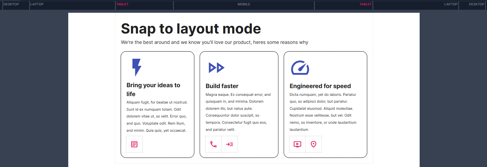
This mode is easiest to develop for as you only have to design and test your content at 5 viewports. The primary downside of this mode is potential wasted space on the sides of your app, and less flexibility in how you can arrange elements on your page.
*Using the 'full width' size option can allow a component to break out of the standard width constraints
Fluid Width
Fluid width will allow your content to span the entire width of the screen, 'Responsive overrides' and sizing options are more important in this mode as your content can end up excessively wide as a user's window width increases, however in return you are given full control over how your app can display on screen.
Imagine you have a tablet breakpoint of 800, and a laptop breakpoint of 1200px, Your browser window is at a width of 1000px, You would see your app's contents at a width of 1000px, the same as your browser window width.
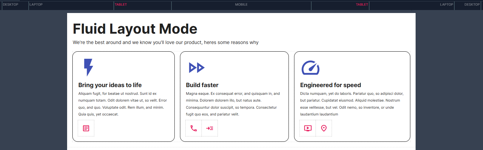
This mode is better if you are experienced in building apps on Toca and/or have an understanding of web design concepts like Flexbox, allowing you to fully utilise the width of the page which may allow for more content on screen. The main downside of this mode is that more testing may be required to account for the variable widths your app will display at.