Docs · Projects
Responsive App Design
Responsive web design is all about crafting websites that adapt to any screen size, from tiny phone displays to massive desktop monitors. The big win? A consistent and user-friendly experience for everyone, no matter how they're viewing your site. This means no more awkward zooming and scrolling on mobile, while maintaining full functionality on laptops and desktops, leading to happier visitors who are more likely to stick around and engage.
Getting Started
Within the app designer we use 5 viewports, these are 'Mobile', 'Tablet', 'Laptop', 'Desktop' and 'Widescreen', these are based on default breakpoint options set within your app's theme. The size of a user's screen will determine what viewport they see, so within your app if you select the 'Mobile' viewport, you will be able to see an approximation of what your app will look like when viewed from a mobile.
Desktop-centric layouts often stumble on mobile. Consider a row of three square images: perfectly viewable on a laptop but potentially too small on a narrow mobile display. Responsive overrides provide the solution. By navigating to the 'Mobile' viewport and utilizing Responsive Overrides you gain the power to modify the layout, transforming the side-by-side images into a stacked arrangement, thus optimizing the mobile user experience.
Implementing Responsive Overrides or visibility
Towards the top of properties panel of app components inside your app, you will see options relating to the visibility of the app component in the current viewport, as well as a button to enable 'Responsive overrides'.
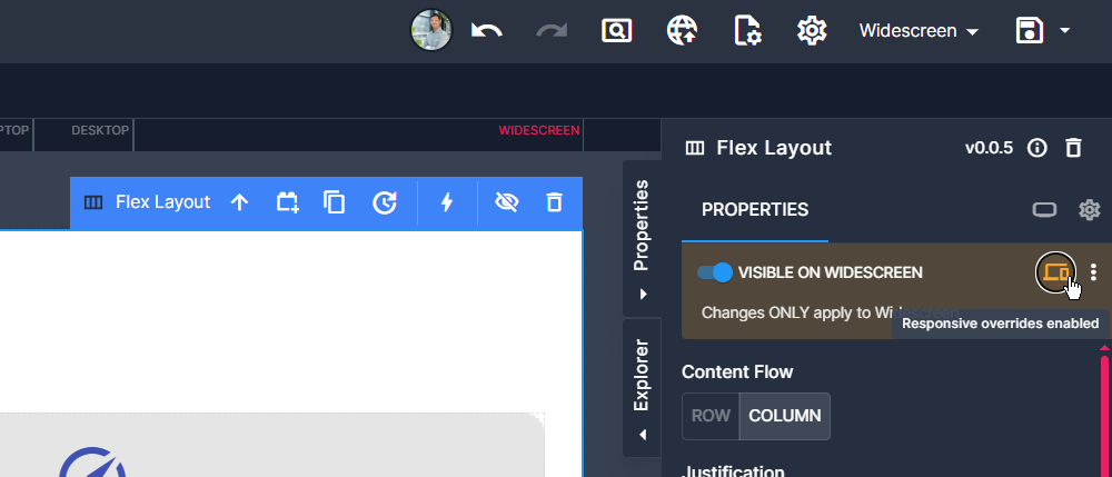
Visible on [viewport] Toggle
This switch will determine whether or not the component (and it's children) are visible on the current viewport. This may be useful for scenarios where you want significantly different elements in different viewports.
As an example, we could place an Icon Button and a larger button side by side, and have the Icon Button hidden in Laptop, Desktop and Widescreen, whereas the larger Button is hidden in Mobile and Tablet viewports. The result being a larger button which turns into an Icon if viewed on anything smaller than a Laptop.
Responsive Overrides
Enabling responsive overrides on a component allows you to specify different options per viewport, this opens the door for full restyling or content manipulation based on the current viewport.
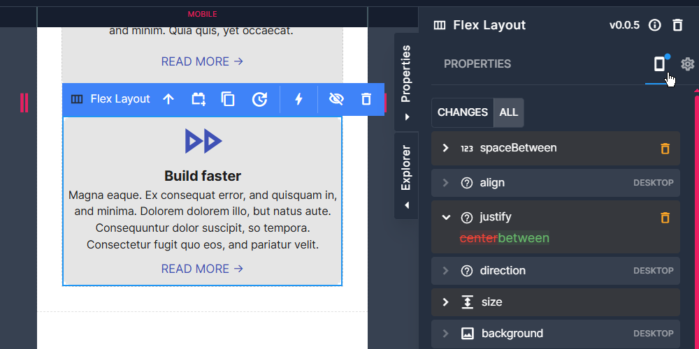
Simply switch to the viewport which you want to change the behaviour on, enable responsive overrides (if it isn't already enabled) then make your changes in that viewport, any changes you make can be visualized by clicking the device icon at the top of the properties pane to show properties which have changed.
A few simple examples of when you might use this: A Flex layout which displays its contents horizontally (Flex Row) can be configured to display its contents vertically on mobile view, or an image which has a width value of 50% in desktop view, but you want it to be of full width in tablet view.
Reviewing Responsive Overrides
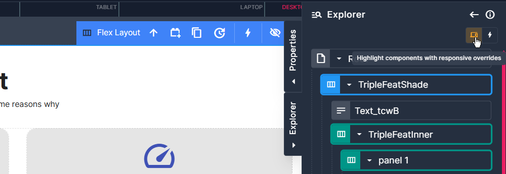
During responsive development you are likely to want to review the changes you have made (or perhaps understand see what changes a collaborator has made), from the explorer pane on the right of the app designer, you can easily highlight which components have Responsive overrides enabled.
On these items with active responsive overrides, we then have a difference viewer tab which will show you what properties are being overridden, please note that these changes only reflect the current viewport. You can revert any overridden properties via the delete button.